|
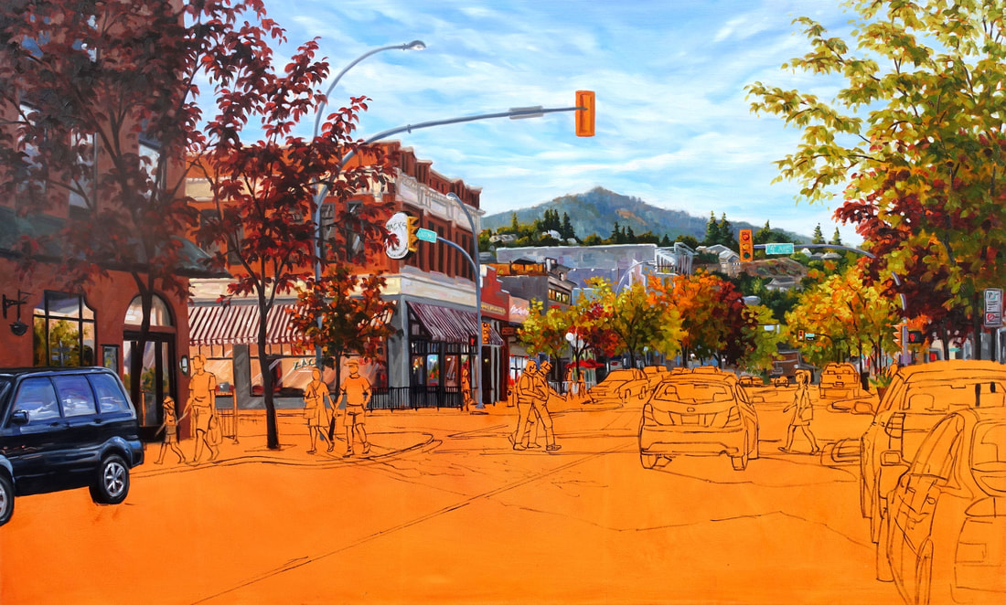
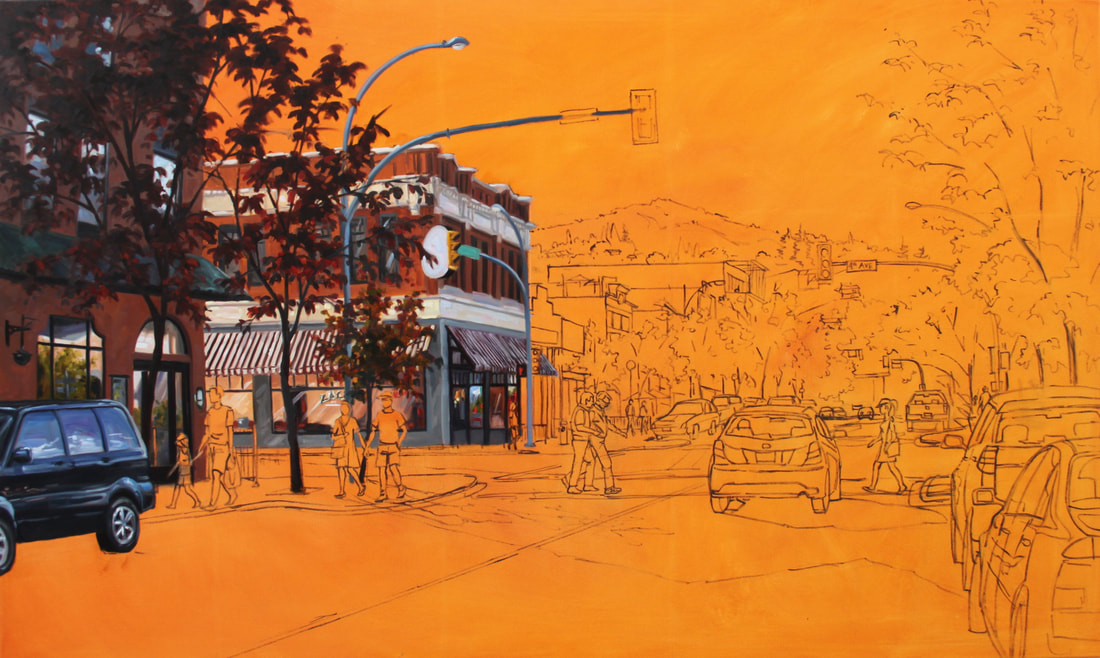
Painting a city scene can be time consuming, why do I love painting them so much!? This scene of Victoria St. in Kamloops is like eye candy with all the colours of late August caught in afternoon light.
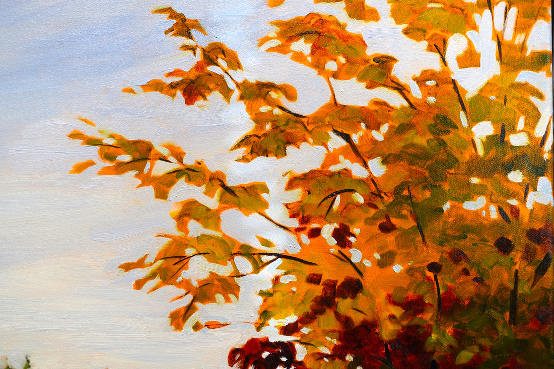
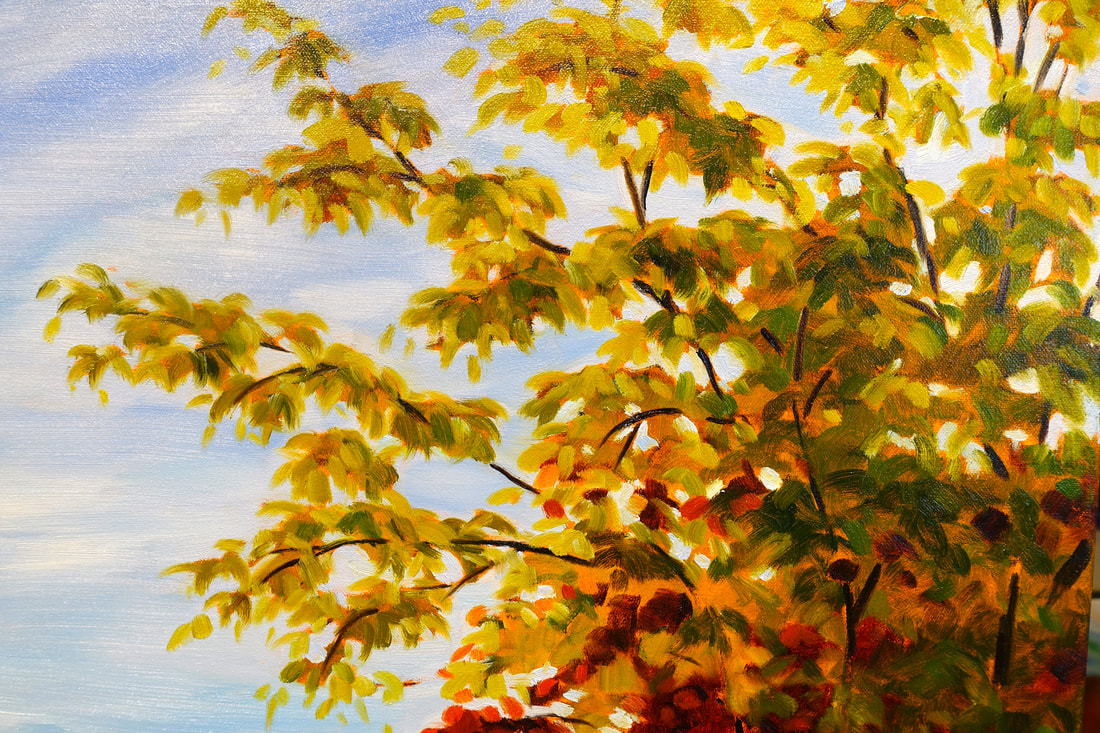
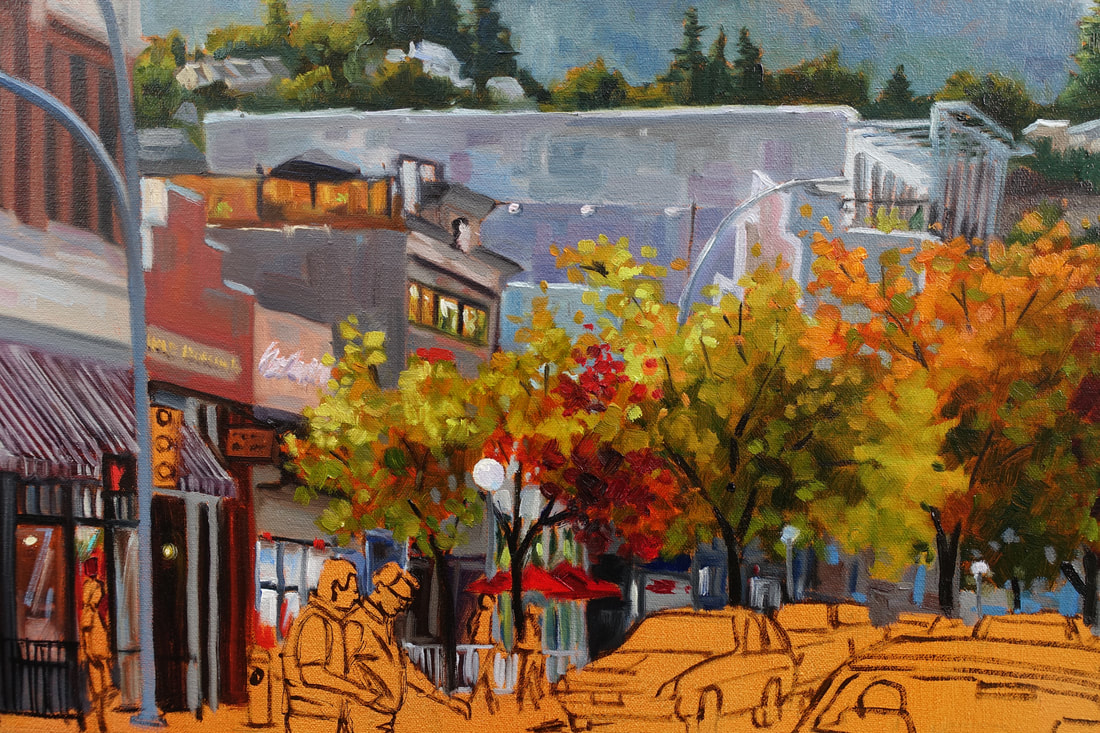
I've shown a few close ups with the brush details in view. The trees were painted first with transparent colours which meant painting around them while they were still wet. The first photo shows how I painted in the negative spaces around the leaves. The second one shows after I softened edges and added more leaves wet in wet. I wipe more paint into my rag than what goes onto the canvas... I call it swipe and wipe. It's a little time consuming and uses a ton of paint. My goals is to keep my colours clean and vibrant. The building details show how I didn't just paint in one flat colour on the sides of the buildings but took the opportunity to make it more interesting by adding other hues of the same value. When faced with large areas that appear to be of one colour it's much more interesting to add some fun colours into the mix. I've taken liberty in this painting when it comes to colour. Why not, it's my artistic license. : )
1 Comment
The first section of this street scene was painted once again in an Alla Prima technique. Some artists layer the paint to achieve depth and light. I choose this painting technique because of the instant results (maybe because I'm a little impatient too!) I love the fact that I can go back in an adjust later once it's all blocked in. The one rule I always follow as mentioned before is working dark (transparent) to light (opaque). I'm always careful not to over mix, over blend and over touch once the colour passage is laid in. I think about every brush stroke before laying it in. The motto is "think twice, brushstroke once".
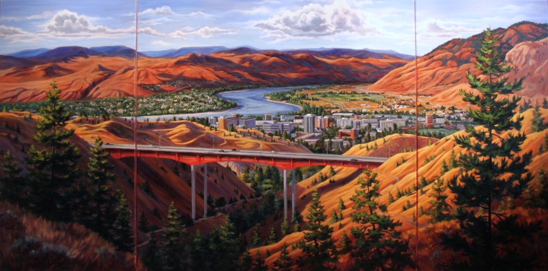
This photo reference is a great one to begin with but the shadows on the street are too dark so I'll paint them last so I can better judge what value is needed in the foreground. FINISHED .... I think! Famous last words of artists at the end of their painting journey. It was very difficult getting a good photo because of the size and winter conditions. I let it dry for a bit before I went in to push and pull light and colour. After almost completing it, I realized the background hills were too warm and were competing with the foreground. I glazed blue over all the hills and painted the very distant mountains with cobalt blue and white (they were more purple). I wanted the foreground hills to have a glowing effect and they had to be warmer than the background.
Painting is definitely good for the brain as you're constantly problem solving! Onto the next one. |
Debbie Milner Lively- AFCA
I've been a professional artist for the past 20 years. I can say the journey has been amazing! .Archives
April 2018
Categories |
 RSS Feed