|
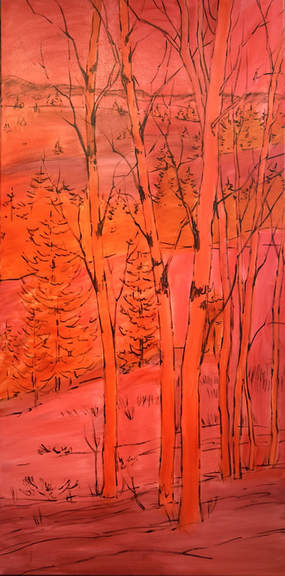
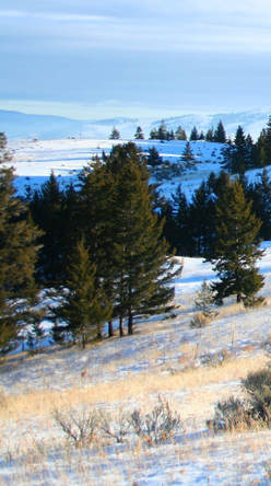
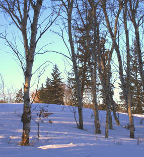
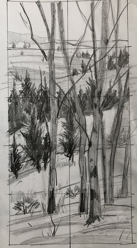
Winter is over here in Kamloops but my passion to paint the beautiful snowy hills around our city has not! I used the two photos shown to compose the painting shown in its toned state. I wanted to feature some aspens trees combined with the rolling hills and warm winter sunlight. My process started with a pencil sketch to work out an interesting design. I actually love this stage and always take my time doing it because as I've said before, a good road map gets you to where you want to go without getting lost! I drew it onto the canvas with thinned Raw Umber and let it dry before toning the canvas with a few of my favorite transparent pigments, Quinacridone Red, and Transparent Red Iron Oxide. I like using Quin Red under the cool snow passages. Next week, I move into Alla Prima painting!
2 Comments
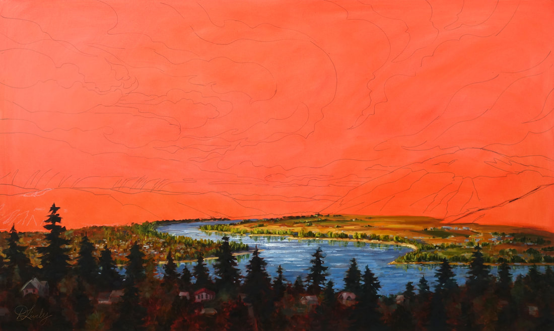 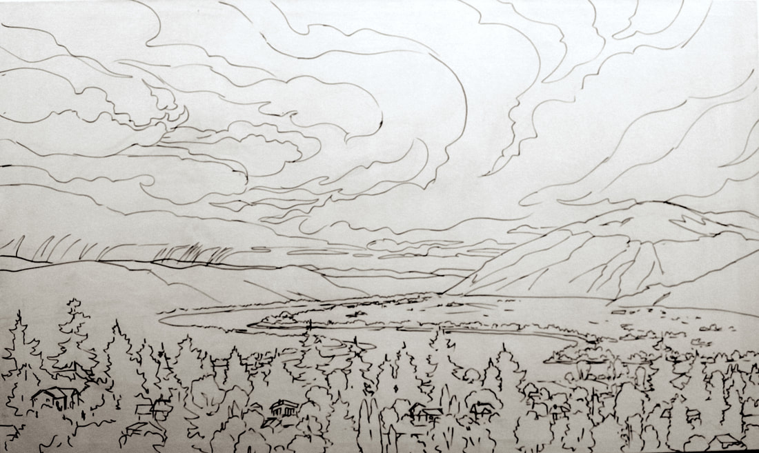 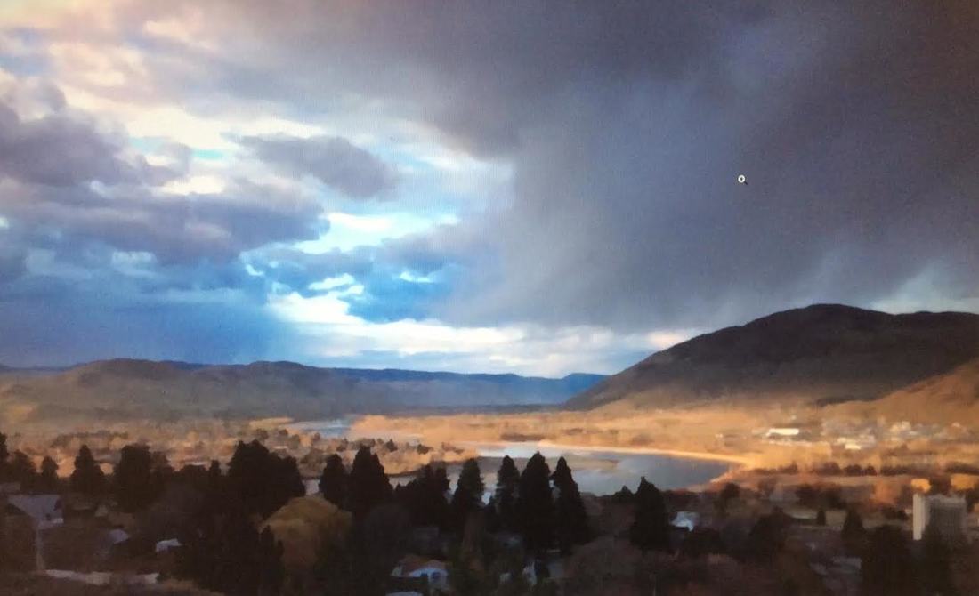 Kamloops is the city of big amazing skies! This next 3x5 ft painting is all about the sky. The photo I took as you can see wasn't a good one at all but it had this ominousness stormy look to it with a beautiful light on the North Thompson. The dark foreground also heightened the drama and intense contrast.
The sketch is pretty detailed as you can see and I added my own creative lines just as a starting point. I'm a believer in a good map of where your journey is going. Diversions are going to happen and that is the fun and creative part. After toning the canvas the first section was completed in a few days. You can see I've changed the foreground tree line already. The sky has to be done in one day so a good nights sleep and an early start are necessary! Hopefully my dog won't decide to go outside 4 times through the night like last night! grrrr! I really have to have my brain wrapped around what my plans are like colours , tones and how much light etc. I want and where. It's kind of like sky diving (not that I've ever done that or ever will!) you just jump in (out)! I want to paint the mountains also at the same time so I can soften the edges between the sky and hills. A Kamloops Urban Scene, finished. 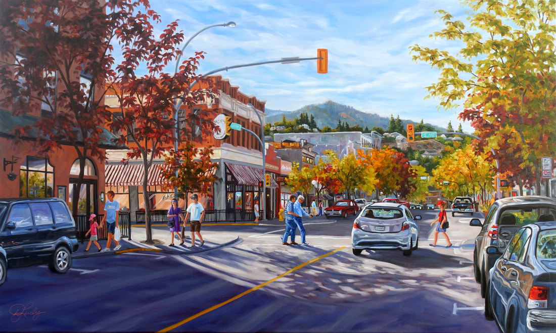 'My Favorite Corner' 3x5ft, a Kamloops urban scene is finished other than waiting till it drys so I can adjust a few things. I love doing commissions for many reasons, I love seeing happy clients, I love the challenge of composing a painting will all the elements the client wants in their painting and of course its a guaranteed sale! The client I'm painting these 8 large paintings for has only given me one criteria, they have to be all about Kamloops which is fabulous because I have alot of creative freedom.
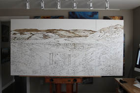
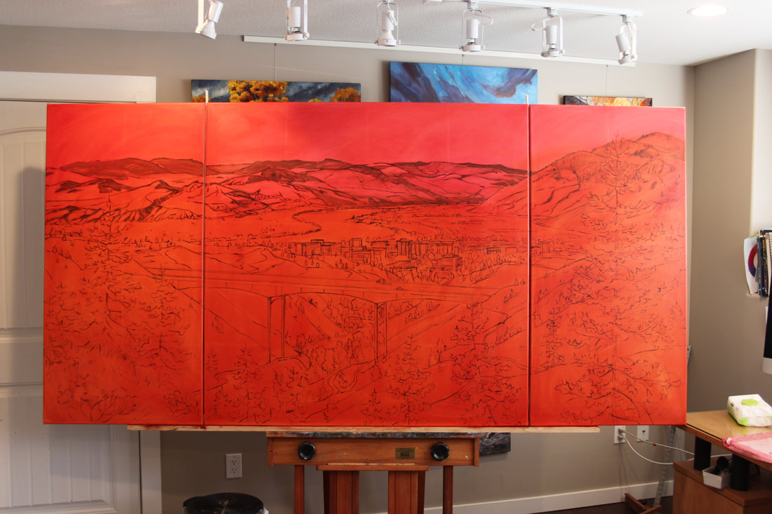
I was taking this photo and my client just happened to come out of his building and walked across the street, so (with permission) he became a part of this piece! I'm asked how I paint reflective surfaces like these cars. My reply is, as simply as you can get away with. Reflective surfaces are really just a combination of coloured shapes like putting a puzzle together. The one skill that you do need is the ability to mix colours you see. I encourage all my students to get to know their tube colours, like a marriage spend lots of quality time with them. Technical stuff: foreground shadow on the street had to be painted wet into wet to achieve the diffused light. I painted the darks first then went in to paint the light. Working back and forth I adjusted values and softened edges. The sky gave me a little grief. I had the clouds quite distinct and obvious and it drew too much attention so I had a nape and then grabbed a 3 in. brush and swiped from left to right blurring the whole sky... bingo, the look I wanted! Painting a city scene can be time consuming, why do I love painting them so much!? This scene of Victoria St. in Kamloops is like eye candy with all the colours of late August caught in afternoon light. I've shown a few close ups with the brush details in view. The trees were painted first with transparent colours which meant painting around them while they were still wet. The first photo shows how I painted in the negative spaces around the leaves. The second one shows after I softened edges and added more leaves wet in wet. I wipe more paint into my rag than what goes onto the canvas... I call it swipe and wipe. It's a little time consuming and uses a ton of paint. My goals is to keep my colours clean and vibrant. The building details show how I didn't just paint in one flat colour on the sides of the buildings but took the opportunity to make it more interesting by adding other hues of the same value. When faced with large areas that appear to be of one colour it's much more interesting to add some fun colours into the mix. I've taken liberty in this painting when it comes to colour. Why not, it's my artistic license. : ) 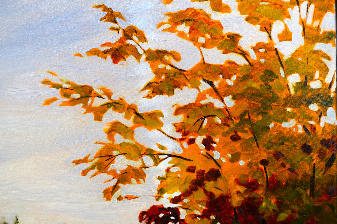 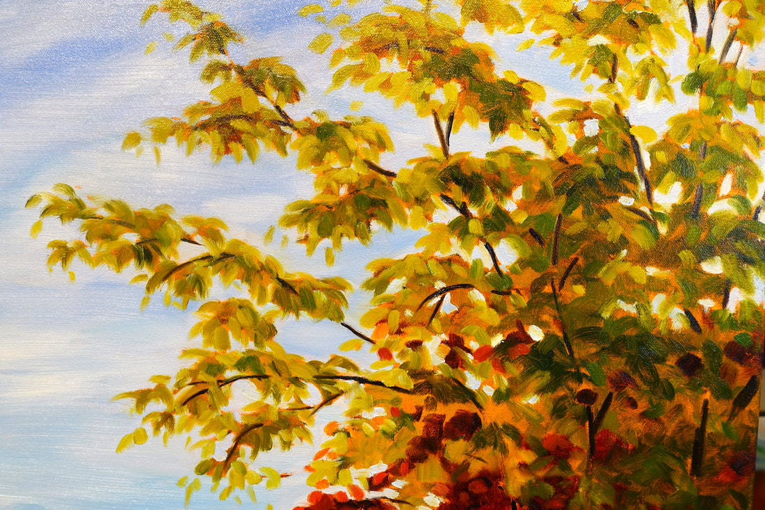 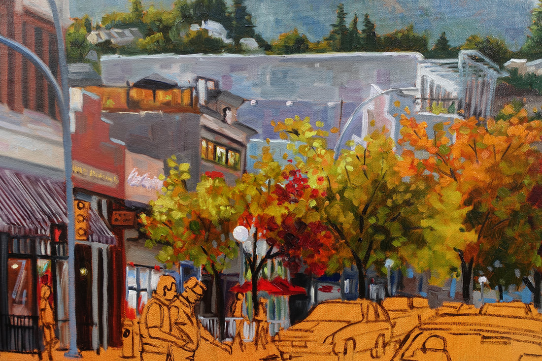 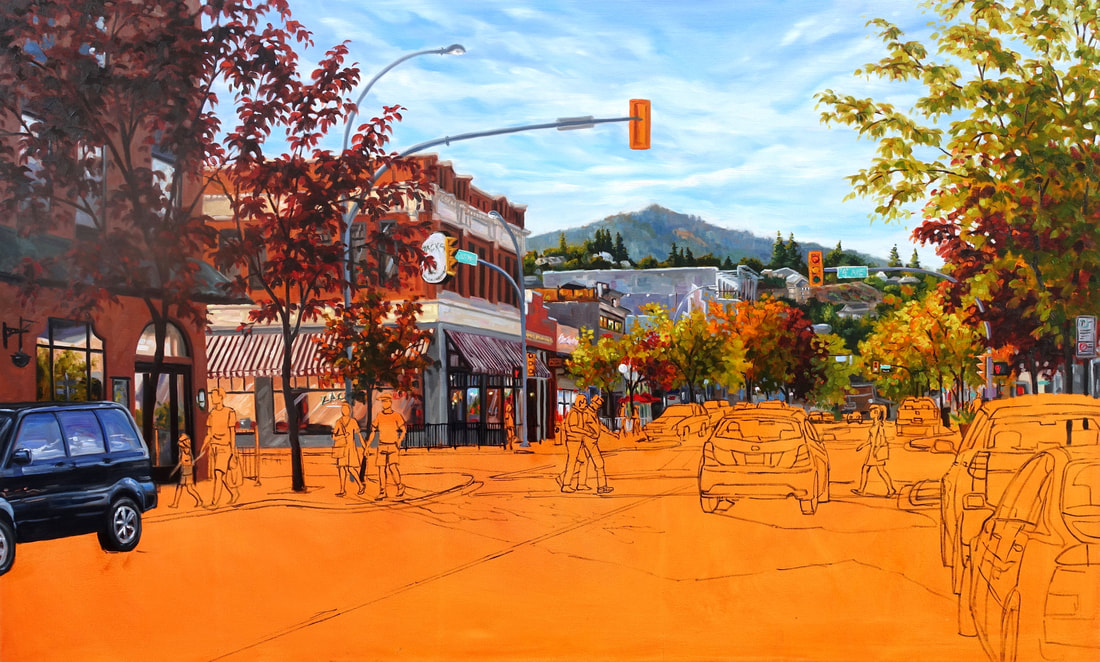 The first section of this street scene was painted once again in an Alla Prima technique. Some artists layer the paint to achieve depth and light. I choose this painting technique because of the instant results (maybe because I'm a little impatient too!) I love the fact that I can go back in an adjust later once it's all blocked in. The one rule I always follow as mentioned before is working dark (transparent) to light (opaque). I'm always careful not to over mix, over blend and over touch once the colour passage is laid in. I think about every brush stroke before laying it in. The motto is "think twice, brushstroke once". This photo reference is a great one to begin with but the shadows on the street are too dark so I'll paint them last so I can better judge what value is needed in the foreground. 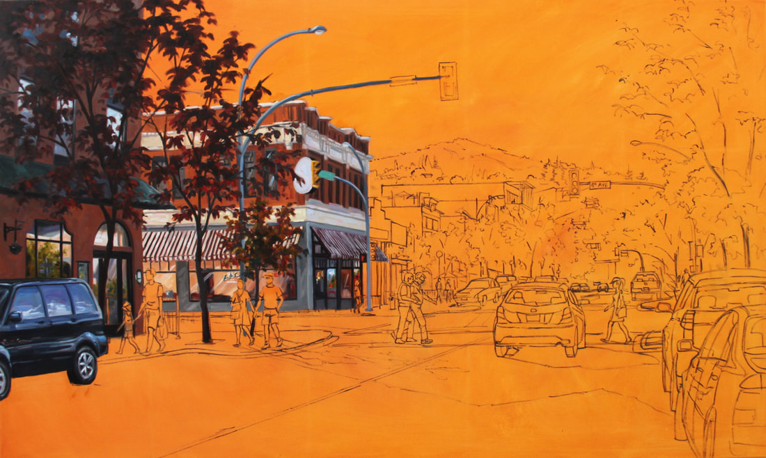 FINISHED .... I think! Famous last words of artists at the end of their painting journey. It was very difficult getting a good photo because of the size and winter conditions. I let it dry for a bit before I went in to push and pull light and colour. After almost completing it, I realized the background hills were too warm and were competing with the foreground. I glazed blue over all the hills and painted the very distant mountains with cobalt blue and white (they were more purple). I wanted the foreground hills to have a glowing effect and they had to be warmer than the background. Painting is definitely good for the brain as you're constantly problem solving! Onto the next one. 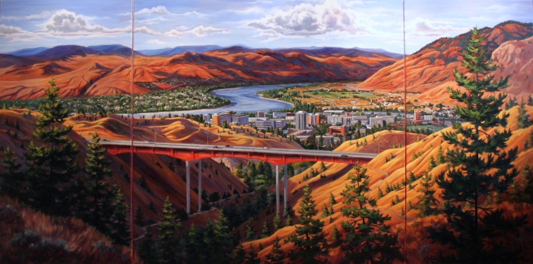 Painting an Urban Landscape in Oils On the easel next is another large 3x5ft painting of my favorite street corner in Kamloops, 4th and Victoria. This drawing took 2 full days and you can probably see why! My theory is 'Get it right and then get Loose!' Perspective is imperative when doing a city landscape. I composed this piece first through my camera lens. I looked for light first and foremost and then balance then lines that can lead the eye in an around the painting. The hotel on the left along with the shadow are great elements to anchor this painting. The cars on the right stop your eye from running off the canvas and adds some interesting shapes. Details like people are drawn last which come from my 'People' file. I often use a zoom lens to take photos of people walking etc so I can use them later in paintings (hope they don't mind!). I drew a graph on to the canvas and photo then used pencil to draw it and then went over all the main lines needed with a small paintbrush and Raw Umber. At this point because I've spent the time to 'get it right' I'm fully confident and ready to enjoy the painting process. I'm always excited to paint this type of subject matter because of the story element in it! You can see in the photo there is lots of glowing light and beautiful colours that's going to make this painting really fun to paint. 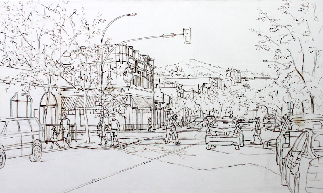 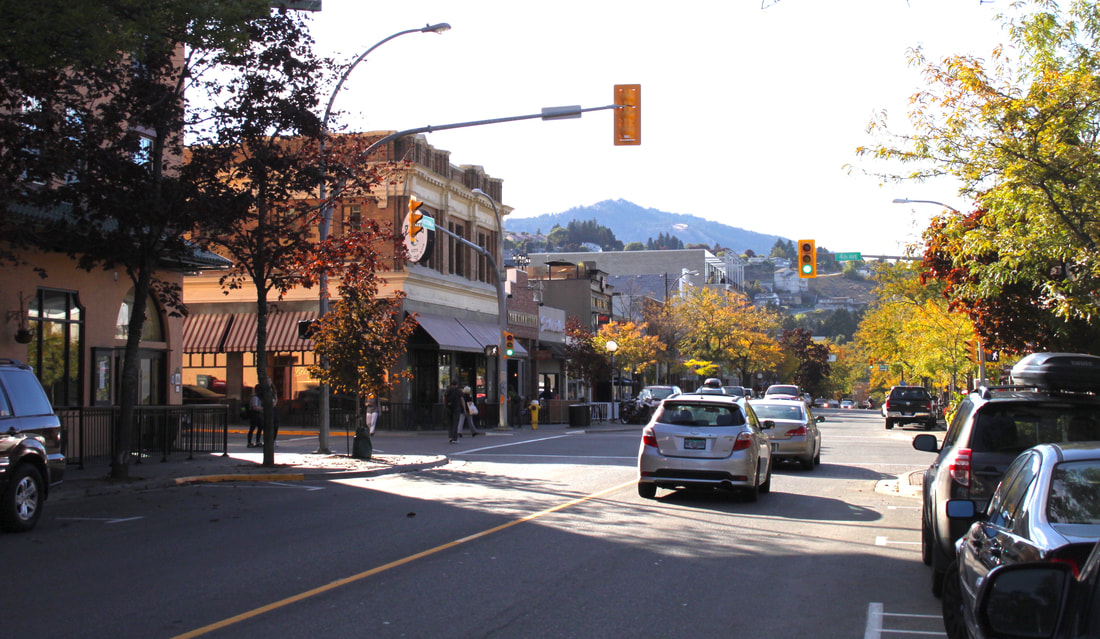 Well its been a few days since I posted this painting. I have to be honest, showing your work and the progress made is putting yourself out there! Artists are there own biggest critic! I kept seeing things I wanted to fix before opening myself up to exposure lol! Since the last blog I've painted in the North Shore suggestively, put more blue hues in the distant mountains (they were too purple and warm), glazed down the river value + background hills. Glazing is done using transparent colours with a medium (alykyd, Linquin etc). This can either cool, warm or put life back into dull areas. I then painted in the left hand corner. The left corner is in shadow and the photo is pretty dead and boring. Artistic license was needed for sure. I used purple (warm and cool) and then while wet added warm tones from reflected light. Seeing and translating is daunting sometimes! I always have a vision of how I'd like things to turn out but it's sometimes through chance and error (maybe a little terror too!) I come to that point. All the areas in this painting will be revisited and adjusted at the end. It's very hard to take a good picture to share as the light coming from windows and lights really alters the true colours. This photo isn't exact but pretty close. Enjoy! 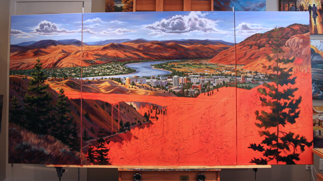 In the past few days I’ve blocked in the shapes of the foreground hills and then the city buildings. Working from photos is challenging because you don’t see near the amount of dimension and colour as in real life. As an artist the photo is only a launching pad of creativity for me. There was a time when I had to paint everything I saw along with all the details. It’s taken some time to free myself from photorealism. Impressionism allows the viewer to fill in details and become more immersed in your story. While blocking in the two foreground hills, I made sure to add the most important recognizable details. I can come back and alters values later. Glazing transparent hues will push back areas like the distant fields. This can’t be done till the first layers is dry. I hunkered down with some good music and painted in the city section. This painting is large enough where viewers would say ‘ Hey, there’s the Staduim!’ I had to actually be pretty detailed but tried to keep some painterly brush strokes while rendering it. By the end of the day after all that detail I felt compelled to grab a large brush and block in the large tree shape in the foreground! Phew that felt good! 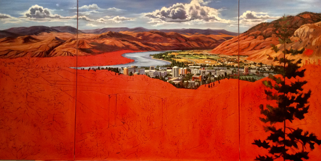 Today, my head was in the clouds! We'll sort of, I drew the cloud shapes onto the canvas with chalk and then painted in the blue sky with cerulean blue + white near the bottom then cobalt blue + white higher up. You'll notice that closer to the horizon the blue is warmer and lighter. For the clouds I used cobalt blue, cerulean blue, quinacridone red, white and transparent red iron oxide to grey it down. I painted clouds from several photo references taken this summer. I have to be careful while driving as the ditch has hit my car twice now while 'seeing' paintings out the window! Painting clouds can be daunting with all the different values and tones not to mention endless edges. I find keeping it simple and a little more impressionistic easier on the brain. I felt this painting needed some drama in the skies to balance the bold palette I'm using for the landscape. Here is a photo of the finished sky and a video for you to enjoy. 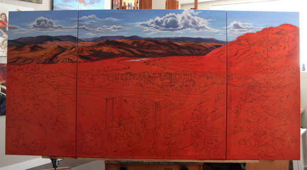 I'm about to embark on a corporate commission that consists of 8 large paintings. The first one is a 4x8ft triptych of a Kamloops scene. Artists start by finding images that excite them. For this one the subject was the Peterson Creek Bridge. On the first non smokey day I grabbed my husband and camera and headed for the hills! The first batch of photos I realized was on the wrong side of the creek so on the next non smokey day... repeat on the other side! Bingo, the perfect vista I envisioned! (of course some artistic lisence is required). 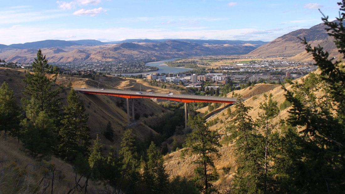 After a small sketch was rendered I transferred the image using the graph system. I went over the drawing with Raw Umber and a paint brush. Raw umber dries quickly. Two days later I had a solid compositional map in which I could with confidence, paint. I chose Red, cool to warm to tone the canvas because I love warmth peaking through, its greens complement and the focal point is the red bridge! Tube colours used: Anthraquinone Red, Quinacridone Red and Chinese Orange (all transparent) thinned with Gamsol.
My favouite way to paint in wet into wet, Alla Prima so edges and hues can be mingled together. I find painting clean fresh colours side by side allows vibrancy. Oils are beautiful to work with but you can create muddy dull mixes quickly so keeping your mixes to 2-3 colors is the key. I create my own earth tones with Cadmium yellow, transparent iron oxide and ultramarine blue, cooling then down with white where needed. I have a brilliant purple ready to grey yellow mixtures. I find tube earth colours dull such as yellow ochre and burnt sienna. On day one I blocked in background hills trying to keep the values close to the photo yet using colours pleasing to me (always more vibrant!). Once dry I can glaze pure transparent hues to adjust the values and colours. 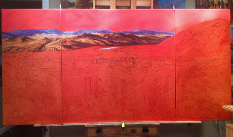
|
Debbie Milner Lively- AFCA
I've been a professional artist for the past 20 years. I can say the journey has been amazing! .Archives
April 2018
Categories |
 RSS Feed